Inspired by color, Dan Perkins paints flat spaces that appear to have layers of depth. His works conjure a feeling of the sublime, intriguing the viewer while also leaving them to question what it is they are viewing. Pulling inspiration from the natural world though appearing quite digital, Perkins’ representations have paradoxical qualities that are filled with logic. Perkins is based in Brooklyn, NY.
How did you develop the style that your work currently encompasses?
Initially, I was working away from representation, taking images and source material and cropping them oddly, or splicing them into patterns. Working through this process, I found that I was more interested in optical shape play, than necessarily questioning the image. I also found a more personal voice in abstraction that was less burdened by theory. And so from there the paintings began to slowly evolve away from image and towards abstraction.
What themes are you exploring in your work?
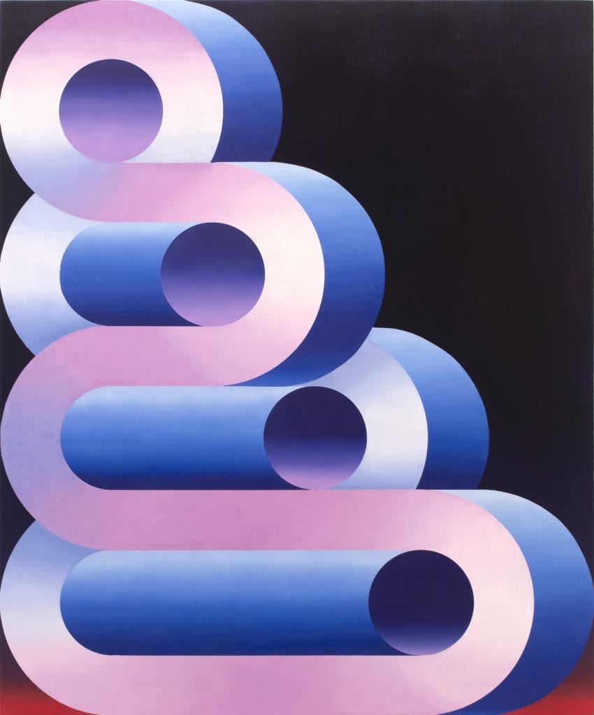
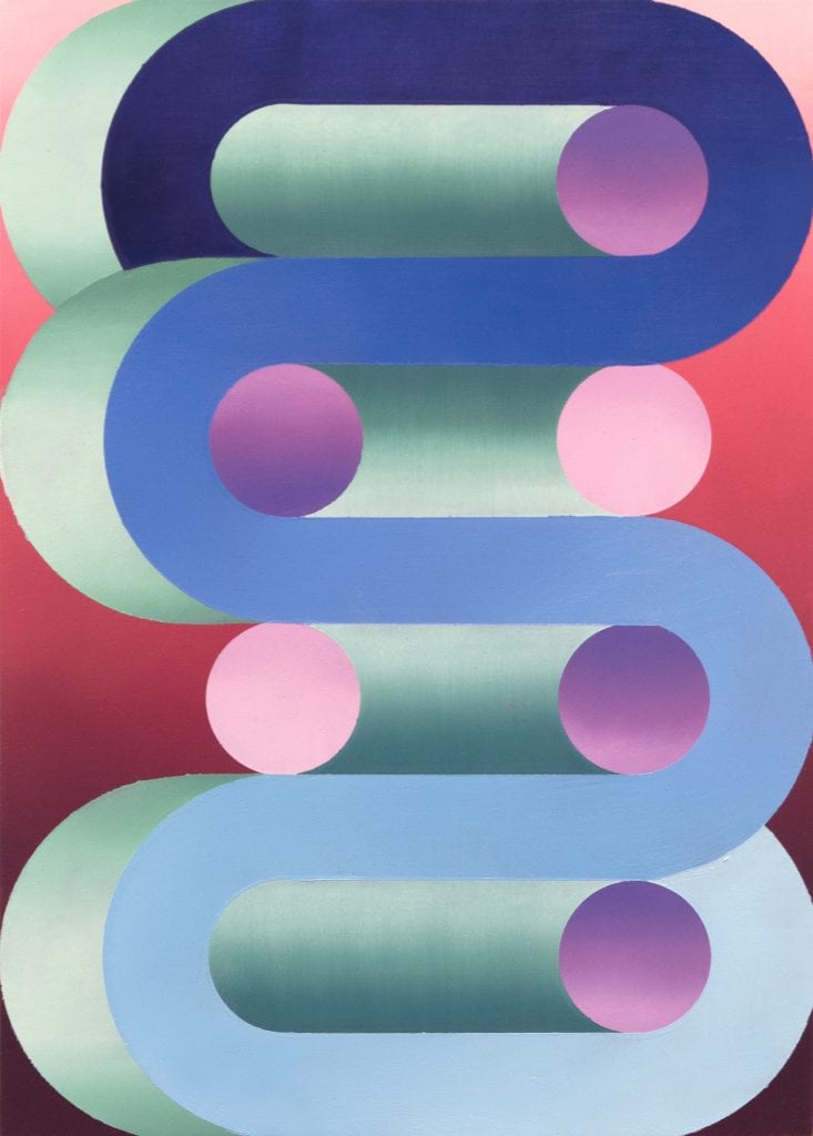
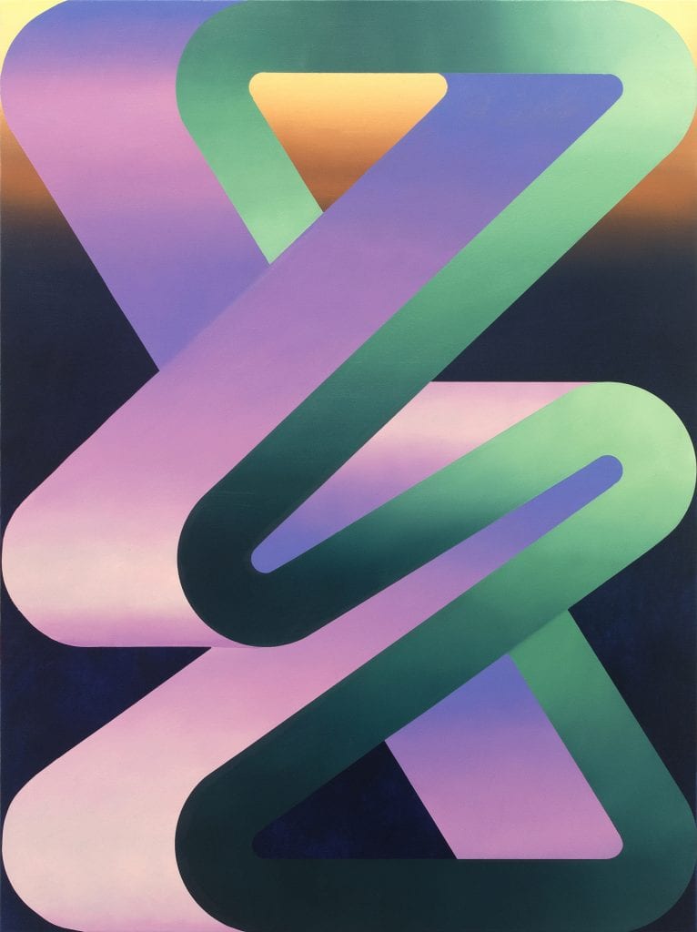
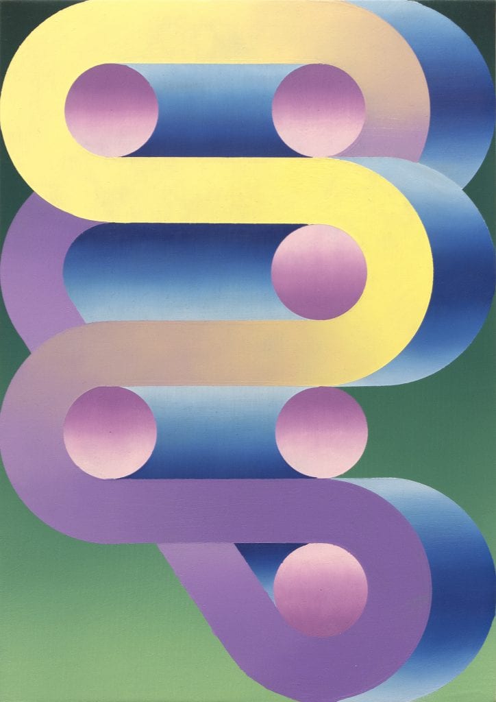
Color has always been a constant source of inspiration, as well as the unique space of a painting, as something that is flat, but has depth. That essential paradox has always been a great source of inspiration. For me, the sublime and its shifting cultural definition has been theme in my work, tangentially or directly, for many years. I often think of my current work as attempting to describe impossible sublime forms. Forms that seduce and reward; hopefully inviting the viewer to linger long enough to slowly tease out their logic.

Your work presents refreshing color combinations. How do you land on the colors you choose?
Finding colors is a slow process for me. Most of my palettes start digitally: cropping, editing, distilling down colors from photos that I have taken, or gathered. I keep a running catalogue of source material, mostly digital these days, but occasionally physical. By and large the images describe the natural world in some sense. Increasingly, I’ve been investigating color and light at night, nocturnes in a sense.
![]()
How does changing scale in your work effect the composition?
All of my paintings are relatively small, ranging from 5’’ x 7’’ to 20 ’’ x24’’ currently. I think something about this head and shoulders space, like a small window or mirror is important to me. In terms of the mechanics, I work from half or quarter scale drawings, so many designs are scalable, going from 4’’ x 5’’ to 8’’ x 10’’ or 16’’ x 20’’. Choosing the scale of a painting depends on the specifics of the design, thinking about particular forms at certain size changes their personality, how they behave optically, what they channel.
What is your process like?
Process is very important to me, I think the meditative headspace that can be achieved while working is something that is hard to find elsewhere. My work starts in variety of small sketch books, playing around with different forms. From there, I transfer drawings into a larger sketchbook, working with a compass, and figuring out how I want to divide up the rectangle. I use graphite to play with value and get an idea of how light will be rendered as well. From these more finished drawings, I transfer the composition onto a prepped panel and begin working in a series of masked layers, carefully mixing and blending oil paint through carefully cut stencils. The paintings slowly build themselves, and I work across a number of paintings at once, so they begin to inform one another, and often tease out a similar color idea or feeling of light.

What art historical movements most inspire your work?
Romanticism has always been a huge source of inspiration for me: its championing of experience as a means to knowledge; its obvious ties to describing and illustrating the sublime experience. In that vein 19th century painters like Caspar David Friedrich come to mind. I view many of the Light and Space artists of the 60s and 70s as having a similar preoccupation with the sublime, but accessing it through very different means. James Turrell is a favorite of mine, and new to me is DeWain Valentine, also of that era. More currently artists such as Tomma Abts, Loie Hollowell, Alex Da Corte, and Hilma Af Klimt have been floating around in my studio. Klimt’s retrospective at the Guggenheim really stuck with me.
Your works have very catchy titles. Where do these derive from?
Titles are tricky. Most are just simply descriptive. Increasingly, I like titles that mimic or hint towards the motion of the form, like a stair, or slide, for example. Or describe a particular time or effect of light, like a green flash when the sun sets over the ocean.
At the end of every interview, we like to ask the artist to recommend a friend whose work you love for us to interview next. Who would you suggest?
Charlotte Hallberg
Alessandro Keegan
Giordanne Salley
Kate McQuillen
Paolo Arao