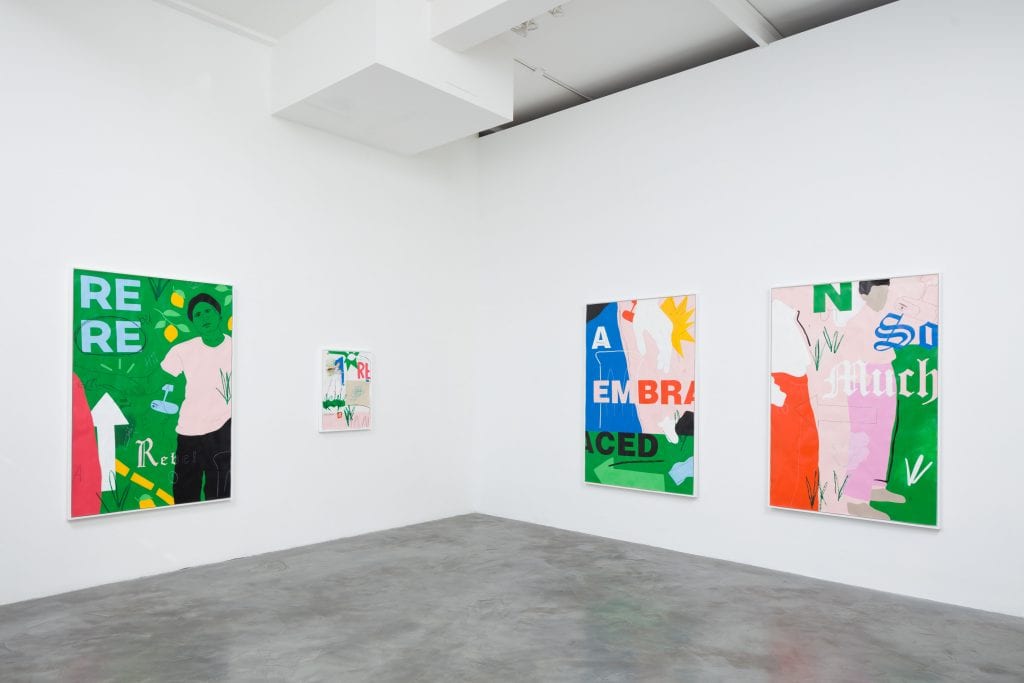
Gabriella Sanchez has captivated us with her bold, visually compelling works that combine fine artistry with elements of design and cultural themes close to the artist’s heart. Often using a recognizable color palette across her works that includes pinks, greens, blues, reds, and yellows, in Sanchez aims to speak to an audience that is both specific and widespread. Through her work, Sanchez explores cross-cultural communication and its widespread effect. She includes personal ties to her family as a way to both personalize and make universal the issues at play. Sanchez lives and works in Los Angeles, CA and is represented by Charlie James Gallery.
Your practice is centered around communication. What about this first grabbed your attention and made you decide it was worth investigating.
My interest in communication came from personal experiences of moving between cultural and socio-economic groups and seeing how your specific form of communication and aesthetic choices could help or hinder depending on who you were specifically trying to communicate with. This all became an interest on a visual arts level while I was in college and started taking graphic design classes and saw these same sorts of dynamics playing out.
You incorporate very personal elements, such as the figures of your family members, into your work. Are these elements kept intentionally vague?
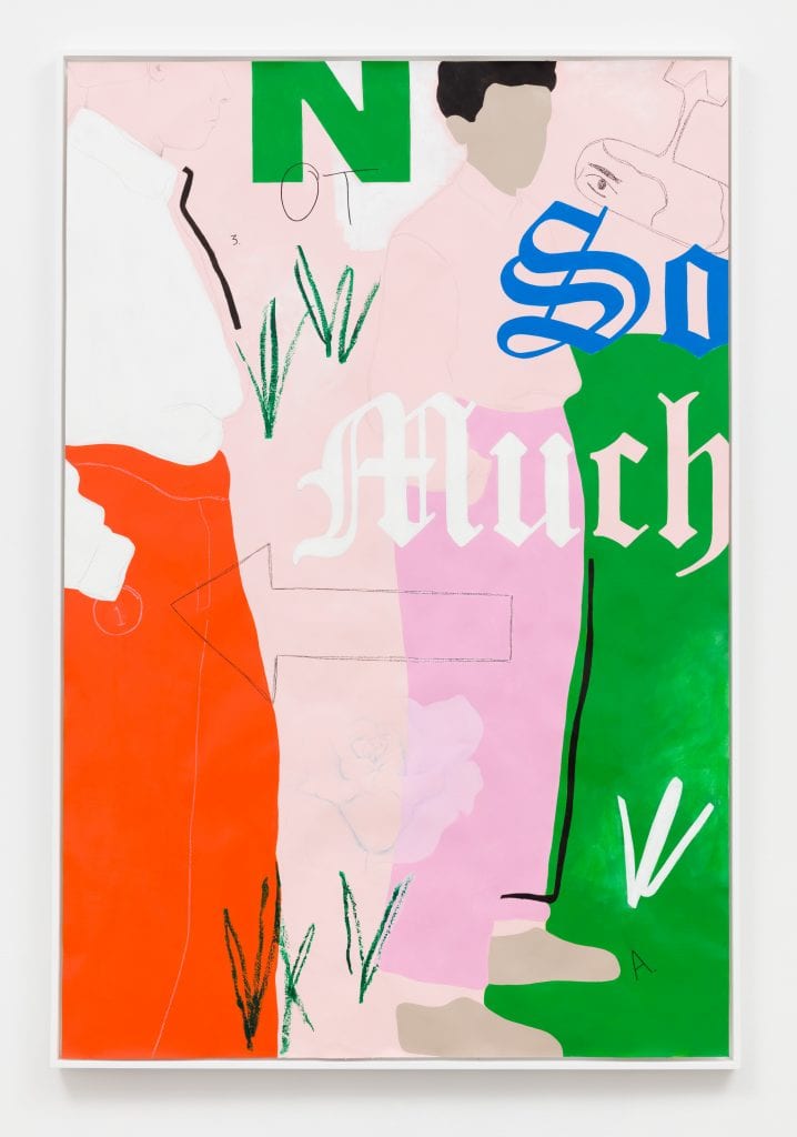
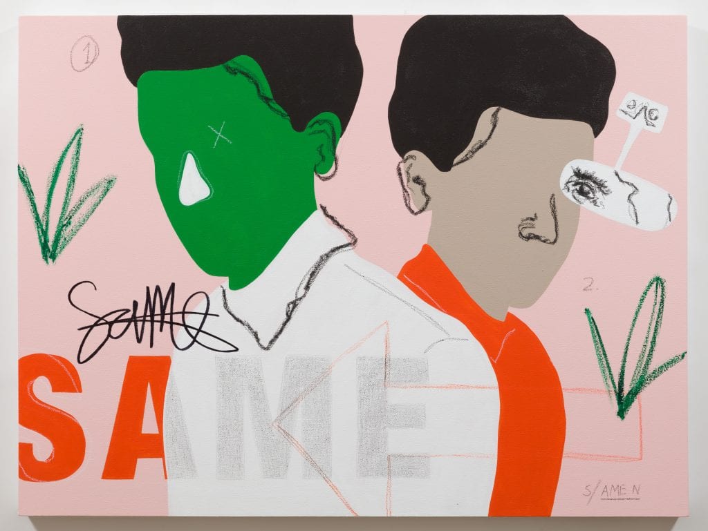
Yes, they’re kept vague for a few reasons. While my work often uses figures from my family the work does not hinge on knowing who the figure depicted is in relation to me specifically. I pull from my personal experiences and observations to communicate wider universal concepts which means I often base my figures off of people who are or have been in my life.
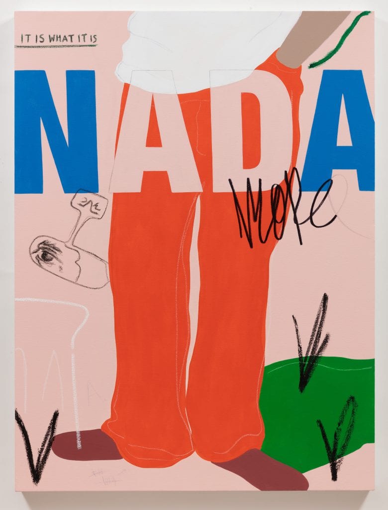
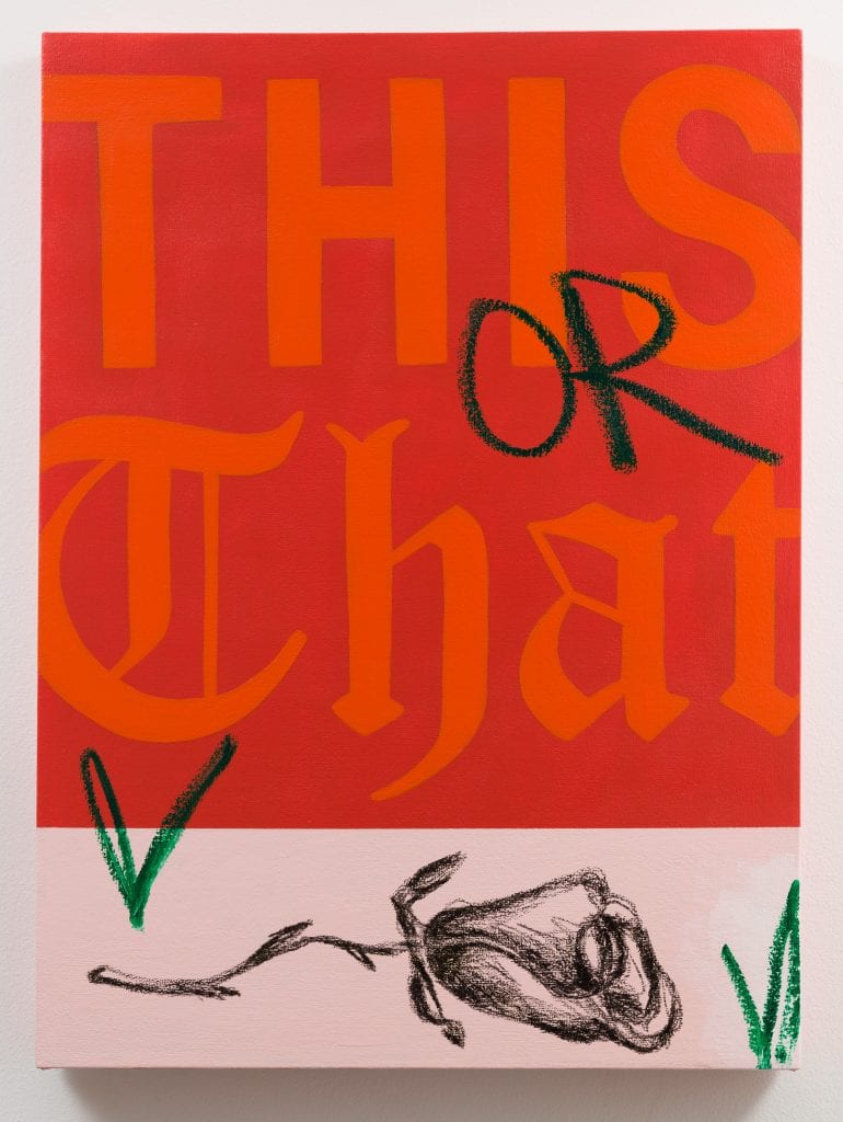
As a person from any marginalized group there is often a pressure to neuter call outs to your specific culture if you wish to make “work that can speak to a wide audience” beyond your specific demographic. I aim to create work that contends with this idea by allowing certain recognizable call outs to show through, but I also keep the figures vague and abstracted as a form of protection because there can be vulnerability in visibility. Specifically speaking, the meaning of a piece is left to the viewer and in my work, I use a lot of doublespeak and intentionally leave ample room for contrary interpretations. In that sense the abstraction serves as protection for the imagined characters in the paintings.
What recurring motifs appear in your work?
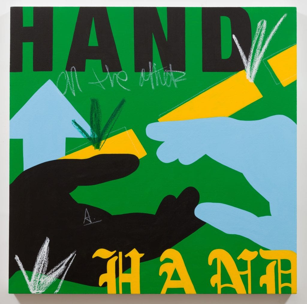
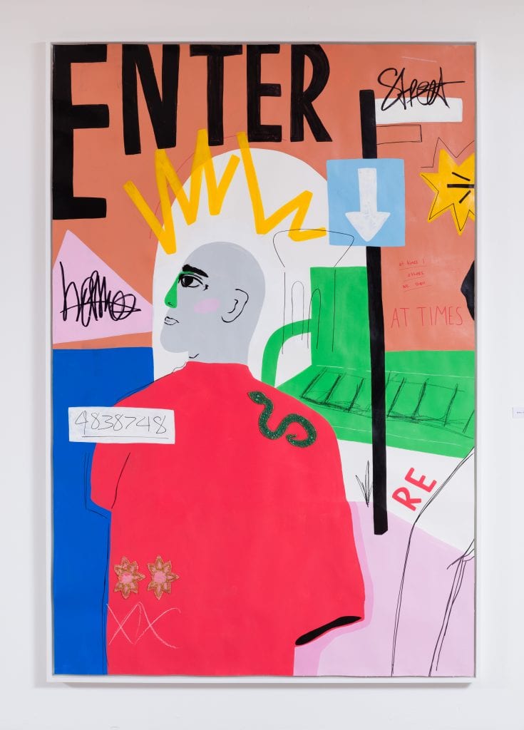
References to multiple sources of light (streetlamps, candles, fire, natural light), rearview mirrors, hand gestures, feet positionings and street divider markings.

What do you hope to accomplish by incorporating various typographies and stand-alone words into your work?
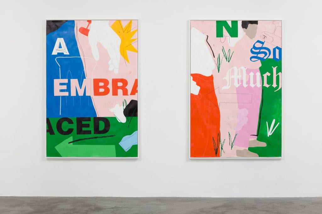
I use typography as another means of exploring how meaning is created in conjunction with language and visual cues. Taking the same word and displaying it in varying font styles is a way in which I show the influence of visuals on a proposed meaning of a word or phrase. I often use forms of doublespeak in my pieces as well so that the phrases could often be read as an affirmation or degradation and that then informs the way the viewer perceives the figures in my paintings depending on their interpretation of the meaning behind the words.
How has growing up in LA influenced your practice?
It’s hard for me to say exactly but I know it has. People often say my work feels like LA and I think it’s because I create my own iconography pulled from personal references so that sometimes evokes an LA ethos. It’s kind of like the advice writers are given to write what they know. I just paint what I know.
What artists most inspire your practice?
There’s not a super concrete answer to this because inspiration is more of a fluid process for me and I like to think of it as an ongoing visual conversation with artists both currently and historically. So, the artist I’m most inspired by changes as I grow and flow. However, some early visual inspirations that keep coming back to me are Sister Corita Kent, R.B. Kitaj, John Baldessari. More presently, I’m very inspired by both the work of Rafa Esparza and the ways in which he navigates the art world.
You’ve had a landmark year, participating in the group show Punch at Jeffrey Deitch in the fall and participating in your first solo show at Charlie James Gallery. What has been the biggest takeaway from these experiences?
Keep centered on your own visions for your work and your career path. Make the work you want to see. Find a community of artists whose work invigorates you and support each other.
What are you looking forward to expanding upon in your practice?
Going deeper into the themes I’ve already laid out for myself while also giving myself the freedom to roam where my interests take me. Allowing my concepts and themes to organically grow and become more expansive and interconnected. I’m also looking forward to incorporating different approaches and media such as screenprinting and video.
What do you have in store for this year?
I’m looking forward to my solo show coming up this June with Charlie James Gallery in Los Angeles. I’ll also be participating in a residency in Hudson Valley this fall at Macedonia Institute. I’m really looking forward to that, just getting away and painting.